Patterns in graphic design captivate audiences and convey messages effectively. This guide reveals pattern design secrets to enhance your projects. You’ll learn essential techniques to create eye-catching, repeating patterns that elevate visual communication.
Pattern design is an art form rooted in design principles. It requires understanding color theory and visual harmony. Mastering patterns can greatly impact your work’s effectiveness and appeal.

Patterns are versatile elements that tie projects together. They’re useful in brand identities and marketing materials. Learning to craft patterns strategically improves your visual communication skills.
Let’s explore fundamental techniques for pattern creation. We’ll cover tools and applications to transform your graphic design approach. If you need help, consider hiring a skilled freelancer for your pattern design projects.
Key Takeaways
- Patterns are powerful tools for enhancing visual communication in graphic design
- Understanding design principles is crucial for creating effective patterns
- Color theory plays a vital role in pattern development and impact
- Adobe Illustrator and Photoshop offer robust tools for pattern creation
- Patterns can be applied across various design contexts, from print to digital
- Mastering pattern techniques can significantly elevate your design projects
Understanding the Fundamentals of Pattern Graphic Design
Patterns in graphic design create visual interest and continuity in projects. They can elevate designs and captivate audiences. Let’s explore key aspects of pattern design and their effective application.
The Role of Patterns in Visual Communication
Patterns convey messages and emotions through design. They create rhythm and guide the viewer’s eye. Patterns also establish a sense of unity in designs.
Line patterns in logos can suggest specific concepts. For example, they might represent radio frequency waves in a wifi logo.
Basic Elements of Pattern Creation
Pattern design is built on shape, color, and repetition. Shapes fall into two categories: geometric (regular) and organic (free-form). Combining these elements creates unique and engaging patterns.
Pattern Types and Their Applications
Different pattern types serve various purposes in design:
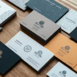
- Geometric patterns: Often used in business card designs for visual appeal
- Organic patterns: Ideal for creating natural, flowing designs
- Icon patterns: Commonly used as website backgrounds
- Seamless patterns: Perfect for textures and backgrounds in design work
| Pattern Type | Common Applications | Design Impact |
|---|---|---|
| Geometric | Business cards, logos | Adds structure and professionalism |
| Organic | Nature-inspired designs | Creates a sense of movement and flow |
| Icon | Website backgrounds | Enhances brand identity and visual interest |
| Seamless | Textures, wallpapers | Provides continuity and depth to designs |
These basics will help you create impactful patterns in graphic design projects. Need help with pattern designs? Hire a skilled freelance graphic designer to bring your ideas to life.
Essential Design Principles for Creating Effective Patterns
Key design principles guide the arrangement of elements in effective pattern creation. These principles help craft visually appealing designs that communicate your message well. They ensure your patterns make a strong impact.

Balance is crucial in pattern design. You can achieve symmetrical balance with even element arrangement. Asymmetrical balance offers a more dynamic look.
Contrast draws attention to specific areas of your pattern. It highlights important design parts and creates visual interest. Use opposing elements to achieve this effect.
Visual hierarchy guides the viewer’s eye through your pattern. Use size, color, and placement to establish a clear order of importance. This creates movement and rhythm in your composition.
- Repetition: Use at least two elements working together to create a cohesive pattern
- Unity: Arrange visual elements harmoniously to provide a sense of completeness
- Emphasis: Draw attention to specific areas by breaking the pattern or using contrasting elements
Mastering these principles helps create visually appealing patterns that effectively communicate your message. Patterns can define surfaces, impact scale, and convey design style across various applications.
“Design is not just what it looks like and feels like. Design is how it works.” – Steve Jobs
Want to bring your pattern designs to life? Hire a skilled freelance designer to create stunning patterns. They’ll align your brand and vision with effective design principles.
Color Theory and Pattern Development
Color theory shapes the visual appeal of designs. It’s crucial for creating stunning patterns. Understanding color relationships can transform your designs from ordinary to extraordinary.
Selecting the right colors elevates your patterns. The color wheel, invented by Newton in 1666, is a valuable tool for this process.
Selecting Color Palettes for Patterns
Creating a cohesive look requires more than picking colors you like. It’s about resonating with your audience. The color wheel helps in this process.
- Primary colors: Yellow, red, and blue
- Secondary colors: Orange, green, and purple
- Tertiary colors: Yellow-orange, red-orange, red-purple, blue-purple, blue-green, and yellow-green

Color Psychology in Pattern Design
Colors evoke various emotions and associations. Warm colors like yellow, orange, and red create energy and excitement. Cool colors like green, blue, and purple often promote calmness and relaxation.
Did you know? 90% of snap judgments made about products are based on color alone.
Creating Harmony Through Color Relationships
Color harmony enhances the visual appeal of patterns. Here are some popular color schemes:
| Color Scheme | Description |
|---|---|
| Monochromatic | Uses variations of a single color |
| Analogous | Uses colors adjacent on the color wheel |
| Complementary | Uses colors opposite on the color wheel |
| Split-Complementary | Uses a color and two adjacent to its opposite |
| Triadic | Uses three equidistant colors on the color wheel |
Cultural context matters in color selection. Red symbolizes happiness in China but can represent danger in Western cultures. Consider hiring a professional designer from Fiverr to ensure your patterns hit the mark.
Typography Integration with Patterns
Blending typography with patterns requires careful font selection and visual balance. Mastering this skill can elevate your design project. Let’s explore how to create harmony between text and pattern elements.
Font Selection and Pattern Harmony
Choosing the right font is crucial when working with patterns. Your typography should complement the pattern’s style without getting lost. For geometric patterns, consider clean, sans-serif fonts.
Flowing script fonts pair well with organic or floral patterns. Contrast is key to ensure your text stands out.
Balancing Text with Pattern Elements
Visual balance between text and patterns is essential for effective design. Use white space strategically to give your typography room to breathe. Consider the golden ratio (1:1.618) as a guide for layout proportions.
This time-tested principle can help create pleasing compositions. It draws the eye to important information.

Creating Typographic Patterns
Typography itself can become a pattern element in your design. Experiment with letter spacing, size, and arrangement to craft unique typographic patterns. These can add depth and interest to your project.
Try using a single letter or word repeated in a grid. A radial composition can also create a striking effect.
| Pattern Type | Suitable Typography | Design Application |
|---|---|---|
| Geometric | Sans-serif fonts | Modern logos, tech branding |
| Floral | Script or handwritten fonts | Wedding invitations, beauty products |
| Abstract | Bold, experimental fonts | Digital media, phone covers |
| Vintage | Serif or retro-style fonts | Classic brand aesthetics, packaging |
Want to take your design to the next level? Consider hiring a skilled freelancer. They can bring your vision to life with expert typography and pattern integration.
Create visually stunning, balanced designs that captivate your audience. Let a professional help you make your mark.
Digital Tools and Software for Pattern Creation

Graphic designers use design software to create patterns. Adobe Creative Suite is the top choice. Illustrator and Photoshop offer powerful features for intricate pattern creation.
Let’s look at some key statistics:
- 100% of surface pattern designers use Adobe Creative Suite
- 80% consider a good computer essential for efficient work
- 70% recommend using a Wacom tablet for digital drawing
Adobe leads the field, but other options exist. CorelDraw excels in vector illustrations and logo design. Procreate offers a budget-friendly alternative at €10.99 for a one-time purchase.
Procreate is great for creating raster graphics that mimic traditional art mediums. When picking design software, think about file compatibility and subscription costs.
Consider scalability needs and the user interface. Adobe products cost about $24.59 monthly. Mastering these tools is key for efficient pattern creation.
The right software can boost your workflow and creative possibilities. Need help choosing design software? Hire a freelance designer for guidance.
Implementing Patterns in Brand Identity Design
Patterns shape brand identity by creating memorable visual identities. They strengthen brand recognition across various marketing materials. Let’s explore how patterns can boost your brand design.
Pattern Usage in Logo Design
Patterns in logos make brands stand out. Geometric patterns offer a mid-century look while staying minimal. Illustrated patterns add character and narrative to logos, enhancing their mood.

Creating Cohesive Brand Pattern Systems
A cohesive brand pattern system ensures consistency in all marketing materials. Brands like Apple, Burberry, and Starbucks use this approach successfully. Their consistent visual elements create powerful, recognizable brand identities.
Pattern Application Across Marketing Materials
Effective pattern use across different mediums strengthens brand appeal. Watercolor patterns work well for food and drink packaging designs. They give a delicate feel.
Marbled patterns can add luxury to high-end products or artistic branding.
| Pattern Type | Best Use | Effect |
|---|---|---|
| Geometric | Logo Design | Mid-century, Minimalistic |
| Watercolor | Packaging | Delicate, Handcrafted |
| Illustrated | Brand Storytelling | Unique, Personalized |
| Marbled | Luxury Products | Dreamlike, Intellectual |
Want to boost your brand with stunning patterns? Hire a skilled freelancer to bring your ideas to life.
Advanced Pattern Techniques and Compositions
Advanced pattern design techniques unlock creative possibilities. Complex compositions can elevate your design projects. Let’s explore cutting-edge approaches to transform your pattern work.

Minimalist patterns are popular for their clean, sophisticated look. They use simple shapes and limited colors for striking impact. These designs are both elegant and versatile.
Gradient patterns offer a fresh take on traditional designs. They blend colors smoothly, adding depth and dimension. This technique works well for digital and print applications.
Exploring element repetition is crucial for cohesive compositions. Experiment with different repeat structures to balance predictability and interest. This approach creates harmonious and dynamic patterns.
| Technique | Key Features | Best Applications |
|---|---|---|
| Minimalist Patterns | Simple shapes, limited colors | Branding, packaging |
| Gradient Patterns | Smooth color transitions | Digital backgrounds, textiles |
| Complex Repeats | Intricate element arrangements | Wallpaper, fashion design |
Want to enhance your pattern design skills? Find a talented freelancer to help you master these techniques. Hire a pattern design expert today and create stunning, innovative compositions.
Pattern Application in Different Design Contexts
Patterns are vital in various design contexts. They shape print design, web design, and environmental design. Let’s explore how patterns are applied in these areas.
Print Design Applications
Patterns add depth to print design. They appear on book covers, packaging, and brochures. Paper texture and printing methods are key considerations.
Glossy finishes make patterns pop. Matte paper offers a subtle effect. Always test your designs before final printing.

Digital and Web Pattern Usage
Web design offers many pattern applications. Patterns can enhance background textures and interactive elements. Screen resolutions and responsiveness are important factors to consider.
Patterns may look different on various devices. Use CSS to create scalable patterns for different screen sizes.
Environmental Pattern Design
Environmental design incorporates patterns into physical spaces. Wallpapers, flooring, and architectural elements often feature patterns. Scale is crucial in this context.
Light and shadow interact with patterns in physical spaces. Different materials affect how patterns appear and behave.
Mastering pattern applications can elevate your projects. Consider hiring a skilled freelancer to bring your pattern designs to life.
Conclusion
Pattern graphic design is a powerful creative tool. It enhances visual communication and keeps you ahead of design trends. Understanding different pattern types, from geometric to complex, serves unique purposes in projects.
Exploring pattern applications across mediums will grow your design skills. Effective patterns boost brand recognition and establish trust. They’re strategic elements that create emotional connections with your audience.
Pattern graphic design is an ongoing journey of refinement. Stay curious and experiment with new techniques. Always consider how patterns can serve your design objectives.
Ready to elevate your design game? Find talented graphic designers on Fiverr to bring your pattern ideas to life.
FAQ:
For the topic: “Mastering Patterns in Graphic Design: Essential Techniques for Your Design Project”
Q: What are patterns used in graphic design?
A: Patterns in graphic design are repeating elements or motifs that create visual interest and unity in a design. They can be geometric, abstract, or inspired by natural patterns. Designers use patterns to add texture, create rhythm, and establish continuity within a composition. Patterns can be used in various design elements like backgrounds, borders, or as standalone design features.
Q: How can I effectively use patterns in my design project?
A: To effectively use patterns in your design project, consider the following techniques: 1. Ensure the pattern complements your overall design and doesn’t overpower other elements. 2. Use patterns to create focal points or highlight specific elements. 3. Experiment with scale and repetition to create visual interest. 4. Incorporate patterns that align with your brand’s identity and message. 5. Balance patterns with solid areas to avoid overwhelming the viewer. 6. Consider using patterns in subtle ways, like as a background texture or within a logo.
Q: What are some popular types of geometric patterns used in graphic design?
A: Geometric patterns are widely used in graphic design due to their versatility and visual appeal. Some popular geometric patterns include: 1. Grid patterns 2. Hexagonal patterns 3. Chevron patterns 4. Polka dot patterns 5. Triangular patterns 6. Herringbone patterns 7. Stripe patterns 8. Diamond patterns These patterns can be customized with different colors, sizes, and arrangements to suit various design needs.
Q: How can I create my own graphic design patterns?
A: To create your own patterns for graphic design, follow these steps: 1. Start with a basic shape or motif. 2. Experiment with repeating the shape in different arrangements. 3. Use design software like Adobe Illustrator to create and manipulate your pattern. 4. Play with color combinations and gradients to add depth and interest. 5. Consider incorporating abstract or organic elements for unique patterns. 6. Test your pattern at different scales to ensure it works well in various applications. 7. Refine and adjust your pattern until you achieve the desired effect.
Q: What are some creative ways to incorporate minimalist patterns in graphic design?
A: Minimalist patterns can add subtle texture and interest to your designs without overwhelming the viewer. Some creative ways to incorporate minimalist patterns include: 1. Using simple line patterns as dividers or borders. 2. Applying subtle textures to solid color backgrounds. 3. Incorporating small repeating elements within typography. 4. Using patterns as negative space in logo designs. 5. Creating patterns with simple geometric shapes in monochromatic color schemes. 6. Applying patterns to specific areas of a design to draw attention or create contrast.
Q: How can patterns help establish unity in a design?
A: Patterns can help establish unity in a design by: 1. Creating visual consistency through repetition of elements. 2. Tying together different parts of a composition. 3. Establishing a cohesive color scheme. 4. Providing a sense of rhythm and flow throughout the design. 5. Reinforcing the overall theme or concept of the project. 6. Creating a recognizable visual identity for a brand across various applications. By using patterns strategically, designers can create a sense of harmony and coherence in their work.
Q: What are some best practices for using abstract patterns in graphic design?
A: When using abstract patterns in graphic design, consider these best practices: 1. Ensure the pattern complements your overall design concept. 2. Use abstract patterns to add depth and texture to your design. 3. Experiment with different color combinations to create the desired mood. 4. Balance abstract patterns with simpler design elements to avoid visual clutter. 5. Consider the scale of the pattern and how it will appear in different applications. 6. Use abstract patterns to create focal points or guide the viewer’s eye. 7. Incorporate brand colors or elements to maintain consistency with your overall design.
Q: How can I use gradient patterns effectively in my graphic design projects?
A: To use gradient patterns effectively in your graphic design projects: 1. Choose colors that complement your overall design scheme. 2. Experiment with different gradient directions and shapes. 3. Use gradient patterns to create depth and dimension in your designs. 4. Combine gradient patterns with solid colors or other design elements for contrast. 5. Consider using gradient patterns in backgrounds or as overlays on images. 6. Adjust the opacity of gradient patterns to achieve the desired effect. 7. Use gradient patterns to draw attention to specific areas of your design. Remember to use gradient patterns judiciously to avoid overwhelming your design.
Source Links
- Patterns and textures can add visual interest to any decorative design, helping to attract attention and enhance aesthetic appeal.
- In the visual world of design, a well-crafted pattern can also help establish a pattern of consistency and unity across branded merchandise.
- Beginning Graphic Design: Fundamentals of Design
- Design Fundamentals: Patterns – Graphic Design Fundamentals
- When design elements repeat throughout like a logo or like business cards, they create a sense of familiarity and professional continuity and repetition.
- Principles of Design in Graphic Design | Graphic Design Institute North Delhi
- Skilled design teams understand how to use patterns and textures can help to highlight a specific element within the overall composition.
- Colors you choose and how they’re used in gradients are transitions of colors that can give depth to your design and help it stand out across various industries.
- 3.4 Organizational Principles | Graphic Design and Print Production Fundamentals
- Design pattern for handling multiple message types
- Creators from around the world expertly mix complementary colors to create a unique visual identity that can appear across multiple platforms.
- The thoughtful use of typography combined with the right shapes and colors can add a natural flow to your design while maintaining consistency and unity.
- Best Graphic Design Software to Create Seamless Patterns
- When you want to learn about the various principles of design, understanding how patterns you see work together is essential to the design process.
- Pattern in Branding, Packaging and Graphic Design – InDesignSkills
- The way elements repeat in that pattern can help establish a pattern of recognition, creating a strong sense of visual harmony.
- Colors from one tone to another can add a touch of sophistication, while careful consideration of size or number of elements helps maintain balance.
- Effective design with texture and thoughtful use of patterns can create visual depth that simple design doesn’t achieve alone.
- Designers also use patterns and transitions of colors from one shade to another to create dynamic visual interest.
- The way we see patterns in design is greatly influenced by how we use typography and the colors you use together.
- Can you explain the Context design pattern?
- Patterns are often used to communicate brand identity, while textures help find the right balance in visual composition.
- Depending on the colors chosen, the same pattern can convey completely different messages and emotions.
- Patterns in graphic design | Pixartprinting
- How Repetition, Pattern, and Rhythm Work in Design
Our Partners: CSKDesignCrafts.com – FitFusioHub.com – LifeCraftsCentre.com
This post contains affiliate links, which means I may earn a commission if you make a purchase through these links. There is no additional charge to you! Thank you for supporting my blog so I can continue creating free content each week!